In its renovation of the skating rink level at Rockefeller Center in New York, INC Architecture & Design brightened the vast subterranean space by exposing ceiling beams, hanging custom bronze pendant fixtures from them, and installing internal LEDs in the new GFRG coves and ribbed frosted glass wrapping the existing structural columns.
For nearly a century, the ice rink at Rockefeller Center has been an iconic New York City destination. But since the 1990’s, the best view of the skaters was reserved for patrons at two upscale restaurants on the lower level. Tishman Speyer, which owns the rink and 14 of the surrounding buildings, sought to change that. In 2019, the real estate company launched an invitational competition calling for a reenvisioning of the subterranean public areas, some 50,000 square feet. “Tishman said to us, ‘We want to democratize the rink,’” recalls Adam Rolston, founding partner and creative and managing director of INC Architecture & Design, which won the competition. He, cofounding partner and construction and development director Drew Stuart, and their staff set about opening up the concourse, improving its circulation and designing one of its restaurants, and, overall, creating an art deco–inspired environment informed by the site’s history.
The project was part of a larger rebranding of Rock Center that aimed to serve three constituencies: the Class A workers populating the offices above and throughout the complex, tourists, and locals. The latter has long steered clear of the area, but Tishman hoped to make it a place New Yorkers would like to go. “At the most fundamental level, it’s a public space with an important role in the civic life of the city,” Rolston continues. The mandate was to bring that spirit into the lower-level concourse, which also serves as a hub to the 47th–50th Streets–Rockefeller Center subway station, one of the city’s busiest.
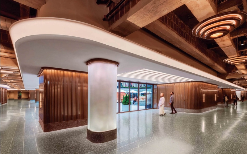
In its renovation of the skating rink level at Rockefeller Center in New York, INC Architecture & Design brightened the vast subterranean space by exposing ceiling beams, hanging custom bronze pendant fixtures from them, and installing internal LEDs in the new GFRG coves and ribbed frosted glass wrapping the existing structural columns.
Rolston has fond memories of skating at the rink as a boy and dining at the adjacent Sea Grill with his father—and then, over the years, “watching it get a little sad.” Stuart remembers rushing through the dreary, mazelike corridors in the ’90’s on his way to the F train. “There was no access to natural light,” he recalls. Beige limestone walls and low ceilings created an oppressive atmosphere, yet the partners still felt connected to it.
“We won the competition because we expressed our attachment to Rockefeller Center through our approach,” Rolston says. “We did a deep dive into its aesthetic history, details, and original ’30’s interiors, and we expressed that love and passion.” EB Kelly, Tishman senior managing director, adds: “INC’s work enhances the feeling that you’re in the most extraordinary place in New York.”

New storefront windows line the public corridors, providing more accessible views of the Rink at Rockefeller Center.
The firm began by creating a master plan with a windowed corridor around the rink, multiple paths to the subway, and space for five restaurants. The team drew on some little-known history: In the early 19th century, the land that is now Rock Center was home to Elgin Botanic Garden, the first in the city, which had a looping, U-shape plan. INC’s flowing layout loosely follows it, with curved walls and perimeter lighting leading visitors through the concourse. “Previously, all circulation funneled through the middle,” Stuart explains. “We freed up the volumes and created more ways of passage.”
As he and Rolston studied the heritage interiors throughout Rock Center, they made another interesting discovery. “When you think of the architecture there, it’s linear and vertical, very masculine,” Rolston observes. “But a lot of the interiors are curved, sensuous, and feminine. So we thought, Let’s make an architecture of flow.” A big inspiration for the project was Radio City Music Hall, where radial light coves form a series of proscenium arches that mimics a sunrise. INC installed a half mile of GFRG coves underground that unfurl like a ribbon to provide wayfinding cues and brighten corridors. Their bronze pendant fixtures—evoking the site’s original tiered fixtures by Edward F. Caldwell & Co.—follow along the way.

Sinuous inlaid bronze in the terrazzo flooring is art-deco inspired, nodding to Rock Center’s 1930’s origin.
Exposing the ceiling also helped brighten. Previous heights were under 10 feet; today, they’re up to 16 in some areas. Crisscrossing beams can now be seen overhead, as can five glass-block skylights, which are installed among planters in Rockefeller Plaza. They have fountains above them, so dappled sunlight filters through the water to the floor below.
The rugged infrastructure contrasts with an otherwise polished interior. Stairs connect the concourse to 30 Rockefeller Plaza, and its glamorous deco lobby informed INC’s concept and material palette. Charcoal terrazzo flooring with inlaid bronze meets tambour paneling of bronze or precast stone. Bronze storefronts frame four of the restaurants, but only a bronze rail demarcates the fifth, 5 Acres, the one INC designed and positioned in the center of the floor plate. This was a key aspect of the proposal from the start: a wall-less anchor restaurant befitting the concourse’s new open, hospitality-driven identity.

Grow lights and irrigation and drainage systems serve the main dining room’s ceiling planters, their live greenery coordinating with the hair-on-hide and leather banquette upholstery.
The hitch was that the 100-seat, farm-to-table eatery with private dining room sits under 30 Rock, and eight giant concrete columns run through it. INC’s solution was to wrap each one in frosted ribbed glass lit to show the structure’s shadow. “We call them ghost columns,” Rolston notes. Like sheer curtains, they’re of a piece with the theatrical quality of the whole renovation. In a clever bit of dramaturgy, Rolston and the crew furnished 5 Acres with Cesca armchairs and a vintage Florence Knoll credenza—mid-century pieces that might have populated the above offices when they first bowed. From those Marcel Breuer chairs, diners aren’t able to observe the skaters on the rink but can instead feel a part of the pulse of New York.
Skate Through This Refreshed Rock Center Concourse With Rink Views
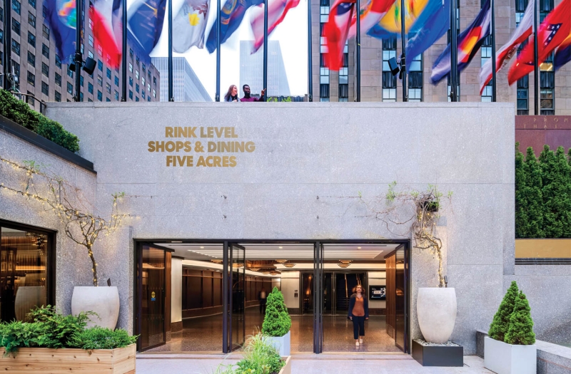
INC and Gabellini Sheppard restored the site’s exterior granite courtyard.
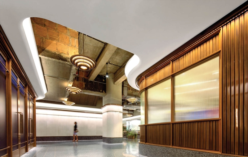
Bronze tambour paneling and custom fluted-bronze door pulls reference the fluted columns in the lobby of 30 Rockefeller Plaza above.
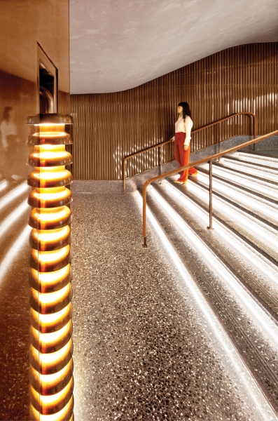
Custom bronze sconces are based on postwar designs by Hans-Agne Jakobsson.
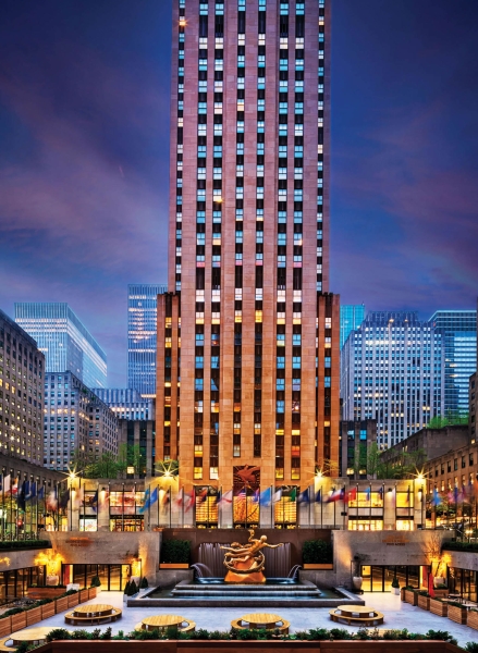
The 48,000-square-foot project is located below 30 Rock.
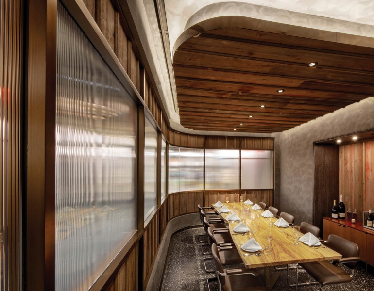
The oak-paneled private dining room at 5 Acres, also by INC, is furnished with a vintage Florence Knoll credenza and Marcel Breuer’s Cesca armchairs and capped by a ceiling of wood planks reclaimed from a barn on the Illinois family farm of the restaurant’s chef, Greg Baxtrom.
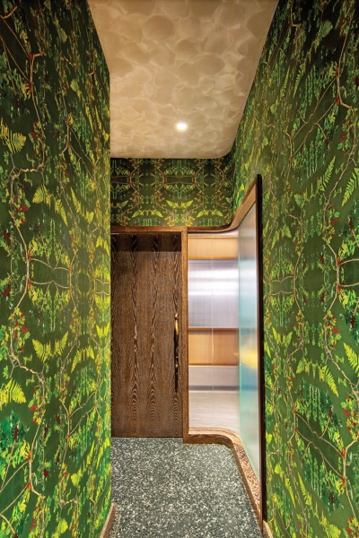
INC founding partner and creative and managing director Adam Rolston collected ferns and branches outside his Upstate New York home, then photographed them to create custom wallcovering for the restroom corridor at 5 Acres.

Ángel Martí & Enrique Delamo’s Book lamp tops its cerused-oak bar.
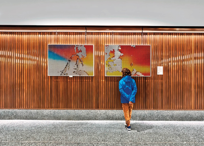
Pieces from the collection belonging to Tishman Speyer, which owns much of the Rock Center complex, appear throughout the complex, including the kinetic flip-disc Time Capsule Over Manhattan by artist collective Breakfast.

Naro is one of four restaurants on the concourse framed by a bronze storefront.
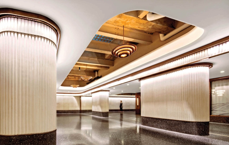
Exposing the ceiling gained some 5 feet of height, the surrounding surface coated in limewash.
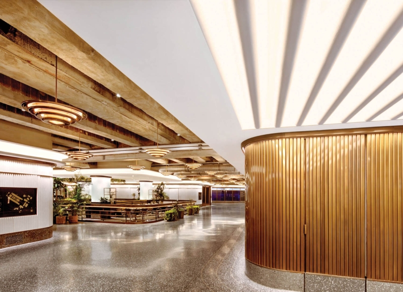
Unlike the four other restaurants, 5 Acres is open to the concourse, separated only by a bronze railing. PROJECT TEAM
INC ARCHITECTURE & DESIGN: GABRIEL BENROTH; NEIL SHAH; MEGAN McGING; SEJUNG KIM; NATHAN MOHAMEDALI; JOSEPH GIAMPIETRO; AMY CAHILL. WATSON SALEMBIER: LANDSCAPE ARCHITECT. 2X4: CUSTOM GRAPHICS. LIGHTING WORKSHOP: LIGHTING CONSULTANT. ADG ENGINEERING: STRUCTURAL ENGINEER. AMA CONSULTING ENGINEERS: MEP. CIDER PRESS WOODWORKS: MILLWORK. TURNER: GENERAL CONTRACTOR.
PRODUCT SOURCES
FROM FRONT CIX DIRECT: CUSTOM TABLES (PRIVATE DINING ROOM, RESTAURANT). KNOLL: CHAIRS, CREDENZA. YORIE: FLOOR TILE. MUNROD FINE CUSTOM UPHOLSTERERS: CUSTOM BANQUETTES (RESTAURANT). TIGER LEATHER: BANQUETTE HAIR ON HIDE. KB CONTRACT: BANQUETTE LEATHER. BROOKLYN GRANGE: CUSTOM PLANTER TROUGH. KOROSEAL: CUSTOM WALLCOVERING. ZANEEN: BAR LAMP. THROUGHOUT ZONCA: CUSTOM FLOORING, CUSTOM INLAY. ARCHITECTURAL METAL FABRICATORS: CUSTOM PANELING, CUSTOM COLUMN SURROUNDS. HYDE PARK MOULDINGS: CUSTOM COVES. HOPE’S WINDOWS: CUSTOM STOREFRONT. LITEMAKERS: CUSTOM PENDANT FIXTURES, CUSTOM SCONCES. PORTOLA: LIMEWASH, PAINT.

