

A delectable cup of coffee is a work of art; naturally, the surroundings it’s served in should be too. That’s the approach Architecture Riot took when creating Bruno Coffee’s second outpost in Toronto, Canada. The design team infused the locale with sculptural elements and subtle curves, creating an inviting cafe that encourages customers to sip slowly.
“Our approach focused on achieving a balance between functionality and aesthetic clarity—where continuous horizontal planes and softened corners establish a natural flow, guiding customers intuitively through the space,” share studio principal Sally Kassar and design collaborator, Javier Huerta, noting that a parred down palette of oak, plaster, and exposed brick offers an interplay of textures and warmth. “Careful spatial planning ensured that the design maximizes the limited footprint while maintaining a clean, cohesive visual language,” they continue. “The end result is a space where each element feels intentional, enhancing both the tactile and visual qualities of the environment.”
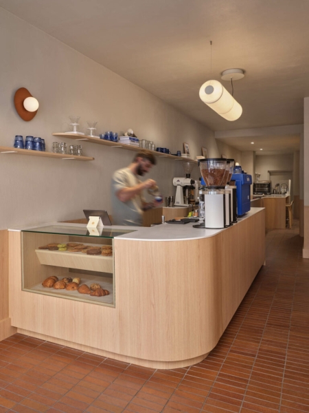
Custom millwork seamlessly melds seating, storage, and display areas, creating a cozy ambience for customers anchored by an expansive service counter. “Instead of placing the service area at the back of the space, we wanted both the barista and the guest to have access to the entire depth of the shop,” the designers share. “This led to a design that splits the space along its length, rather than in the more typical, shorter direction.” Organically shaped sconces echo the curvature throughout while original brick flooring nods to the site’s retail history. “Every detail was carefully considered to create a cohesive rhythm, balancing practicality with warmth, and ensuring the space feels inviting and comfortable,” they add.
Meanwhile, the building’s Queen Street West facade lures customers with its striking shade of blue. “The decision to use a vibrant blue façade was driven by a desire to establish a strong visual identity for Bruno Coffee while maintaining a dialogue with the Queen West streetscape,” say the designers. “Beyond its aesthetic appeal, the blue façade reinforces Bruno’s brand identity, establishing continuity between its locations while offering a fresh interpretation suited to Queen West’s dynamic architectural fabric.” Bruno Coffee’s considered design decisions leave a lasting impression—one that embodies the brand’s slow and intentional cafe culture.
Unwind In The Latest Bruno Coffee Outpost
Oak millwork and integrated seating introduce organic texture and warmth, while soft plaster adds a subtle depth.
Existing brick flooring was thoughtfully retained and reinterpreted, serving as a nod to sustainability and a connection to the site’s layered retail history.
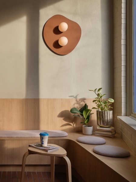
Organically shaped wall sconces by Luminaire Authentik add warmth.
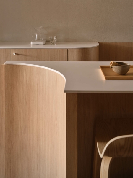
The subtle curves in the center service counter, with Glacier White counter by Corian solid surfaces, are mirrored in design details throughout.
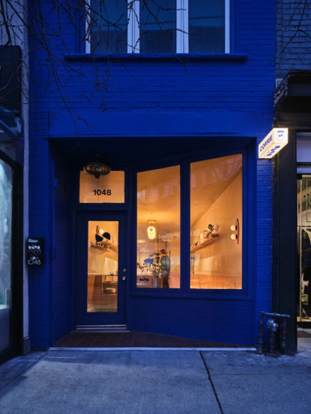
The café’s bold exterior acts as a visual beacon in the neighborhood.
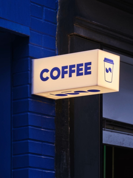
Bruno Coffee signage.