Contents
- 1 E.B. Min Champions Diversity In Her Design + Architecture Work
- 1.1 Interior Design: What does E.B. stand for and how did the appellation come about? Was it a nod to gender neutrality?
- 1.2 ID: What are your earliest memories of design and its influences?
- 1.3 ID: Given your education, how did you envision combining art and architecture?
- 1.4 ID: Along with architecture and art, let’s add landscape architecture to your mix. What was that experience like?
- 1.5 ID: Speaking of women-owned and -led, have you made a conscious effort toward diversity in your studio?
- 1.6 ID: As a related question, what is the Missing 32%, an initiative you helped establish as a board member of AIA San Francisco, and is now renamed Equity by Design?
- 1.7 ID: Let’s take a tour of some of your recent projects, spotlighting their variety: the ICA SF, an art museum; a San Francisco residence with light a prominent element referencing James Turrell; and a TriBeCa penthouse, 3,000 miles away. What are some salient features of each?
- 1.8 ID: Having gone through Covid-19 and flexible return to work strategies, the design world certainly knows challenges. What are some of the biggest it currently faces?
- 1.9 ID: What is your take on AI?
- 1.10 ID: We can’t resist. As a long-time San Francisco resident, what are some of your favorite spots?
For an apartment in an 1844 warehouse in TriBeCa, Min created wall recesses, wall columns, and soffits, along with bespoke cabinetry, to complement existing conditions and help redefine spaces. Photography by Brooke Holm.
In a landscape populated with multi-hyphenates and champions of diversity, E.B. Min, founder of her San Francisco-based, studio Min Design, has long been an exemplar of both. An architect by training, she started on a pre-med track, switched to art history and studio art, then completed cross-register studies at Brown University and the Rhode Island School of Design followed by a Master of Architecture from the University of California, Berkeley. She holds experience in landscape architecture and bona fides in education having taught at U.C. Berkeley and California College of the Arts.
Though only six staff strong, her 20-year-old firm, a denizen of the city’s Dogpatch neighborhood—a lively mix of historic shipyards, warehouses, and a growing arts scene—has completed the proverbial project gamut, from multi-family housing and private residences to work places, an art museum, and public installations. A number of these endeavors share an elusive reference to the arts. Maybe most esoteric of all? A restroom in the new five-acre China Basin Park developed by Tishman Speyer and the San Francisco Giants.
A Korean American, Min hails from a polymath family, undoubtedly an influence on her own varied accomplishments along the career path. Her father was a professor of zoology, then involved in business development for a company making dialysis equipment. He was a polyglot, fluent in English, Korean, and Japanese, as well as an opera singer. An IRS agent and tax auditor, her mother embraced math and feminism. Min grew up in single-family homes in Atlanta; Clemson, South Carolina; and Littleton, Colorado. The seeds of an architect were planted when young Min visited the South Carolina house during construction and strolled through its framing. Memories related to her heritage run deep, too.
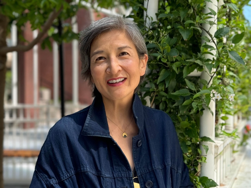
Portrait of E.B. Min. Photography by Jeff Fassnacht.
E.B. Min Champions Diversity In Her Design + Architecture Work
Interior Design: What does E.B. stand for and how did the appellation come about? Was it a nod to gender neutrality?
E.B. Min: It stands for my first and middle names, Eunice and my Korean name Byung Ah. A friend had sometimes used it as a nickname in college, and I decided to use the name full time after graduating. I did like the gender neutrality aspect and the reference to E.B. White as well.
ID: What are your earliest memories of design and its influences?
EBM: When I was about five or six, I visited Seoul, and I remembered feeling that we were somewhere that looked and felt very different—my grandmother and part of my extended family still lived in a traditional Korean courtyard house. That sunny courtyard with packed dirt surrounded by the porch covered with large eaves still remains deep in my memory, as I had never been inside a courtyard before. It, along with the house’s contrast of light and shadow, made a lasting impression.
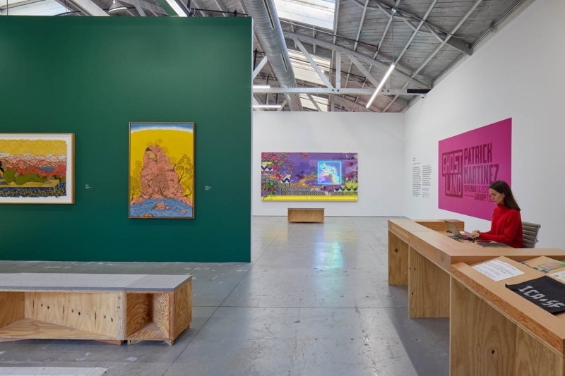
The studio created custom modular furniture, and its aesthetic is derived from the site’s roots. Photography by Bruce Damonte.
ID: Given your education, how did you envision combining art and architecture?
EBM: At the time, I didn’t think there was a real division between art and architecture. I got the impression that architecture was large enough to accommodate art along with my other interests. I was fortunate to have been introduced to architecture at RISD as it was within an art school. In graduate school, art was less part of the conversation and the atmosphere.
ID: Along with architecture and art, let’s add landscape architecture to your mix. What was that experience like?
EBM: For three years, I worked for Andrea Cochran and Topher Delaney, partners in a landscape office that also had a design-build component. This was an amazing experience: women owned-led company with construction and a highly idiosyncratic and refined design sensibility. Both of them operated as landscape architects and artists.
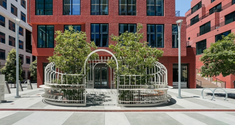
In work, Garden Party draws on greenhouse imagery as a public installation aimed at providing a semi-enclosed area to socialize and dine within the urban streetscape of the mixed-use, waterfront development, Mission Rock. Photography courtesy of Mission Rock.
ID: Speaking of women-owned and -led, have you made a conscious effort toward diversity in your studio?
EBM: Being a woman and Korean-American, diversity is something I inherently participate in. By my nature, my office has attracted diversity, making both the studio environment and the work more interesting. The majority of people who apply are women. We also like diversity in work, not just in project type, but in scale, clients, budget, and approach.
EBM: The Missing 32% was spurred by the release of Architect Barbie. It led to a panel of women discussing experiences in the field and was a highly attended and emotional event. It also led to articles highlighting women disappearing from the profession. While women comprise 50% of architecture school graduates, they were only 18% of licensed architects. We put together a symposium with panels, originally planned as a one-day event, and it later led to Equity by Design.
A four-story stairwell is both the vertical connector and a canvas for light sculpture. Photography by Joe Fletcher
ID: Let’s take a tour of some of your recent projects, spotlighting their variety: the ICA SF, an art museum; a San Francisco residence with light a prominent element referencing James Turrell; and a TriBeCa penthouse, 3,000 miles away. What are some salient features of each?
EBM: With ICA (Institute of Contemporary Art), I like to say that the architectural solution was not to do any architecture. They were operating out of a 10,000-square-foot, exposed concrete warehouse and had about 14 weeks until their inaugural show. They were thinking about building improvements. We, instead, focused on the minimum needed to support the art. So, we created gallery walls and designed modular and easily reconfigured furniture from standard plywood and framing lumber. For a simple lighting system, we used off-the-shelf products from on-line retailers.
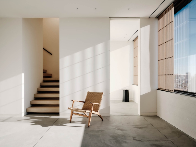
On a different scale, Capturing Light, our newest San Francisco residence, was a long project with a high level of detail, and execution. For a constrained site with only two exposures, we were able to create a series of moments throughout that reflect, highlight, or manipulate light in various ways. Though deceptively simple looking, the project reveals changing lighting conditions in places such as the sunken spa terrace and folded planes in the stairwell. It is a secretive house where art and architecture are both present in the design.
The TriBeCa penthouse is a remodel of an apartment in an historic warehouse. While light and views were beautiful, developer finishes were not to the clients’ liking. We were asked not to move walls but to make better use of existing spaces. In our design, cabinetry and millwork adds function while hiding or integrating such conditions as soffits, columns, and mechanical shafts, all to create deceptively simple and refined spaces. For the stair, we replaced a glass guardrail with painted steel panels and designed a playful under-the-stair hideout.
ID: Having gone through Covid-19 and flexible return to work strategies, the design world certainly knows challenges. What are some of the biggest it currently faces?
EBM: We’ve been consistently challenged in communicating exactly what we do and its value. Everyone notices bad design; few notice when something works well. I believe many people think design is how something looks, not how it behaves or the experience it provides. This overlaps with questions about AI and the role/value of the architect in creating the design experience.
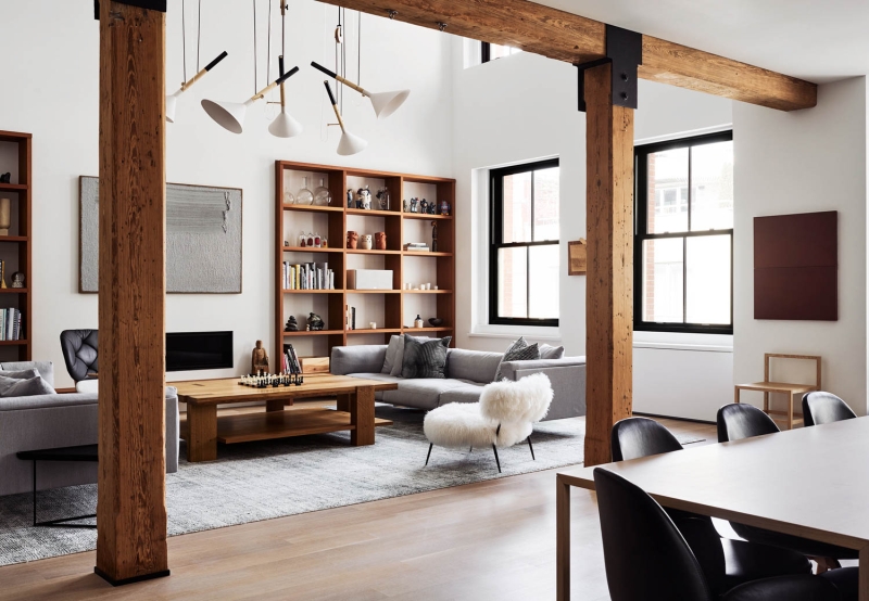
For an apartment in an 1844 warehouse in TriBeCa, Min created wall recesses, wall columns, and soffits, along with bespoke cabinetry, to complement existing conditions and help redefine spaces. Photography by Brooke Holm.
ID: What is your take on AI?
EBM: While the studio has not yet started using it for design, I see it has an incredibly powerful role that we’re already using in our general lives with online apps and tools. Anything to help reduce some of the repetitive, information-gathering analysis is welcome.
ID: We can’t resist. As a long-time San Francisco resident, what are some of your favorite spots?
EBM: Green Apple Books, a favorite visit for me and my daughter. Community gardens, particularly one in the Mission on Dearborn Alley. The Vulcan Stairway in Corona Heights where there is an easy hike with panoramic views of the city. San Francisco Botanical Gardens, wonderful year-round to have a picnic and relax with friends. Hahdough Bakery in Hayes Valley, especially for the gluten challenged. Bernal Cutlery, a fantastic small collection of pantry items, a delicious tinned fish display, cookbooks, and cooking implements. SF76, a Japan Town shop with which I am obsessed for its housewares and other goods. ICA SF, of course for its shows and excellent community programming.
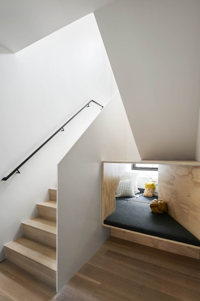
With new painted steel panels as a guardrail, the stairway for a New York apartment is a focal point and means to create a playful hideaway at its base. Photograph by Brooke Holm.
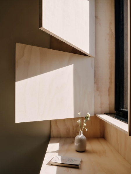
Modular shutters manipulate illumination and views in a San Francisco residence. Photography by Joe Fletcher.

